Danni Hu InfoVis Final Project
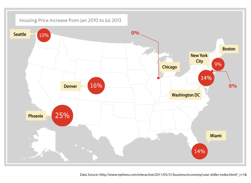
Housing Price Increase from Jan 2010 to Jul 2013 in selected major cities with homeless problem (1st Iteration)
One of the factors that create homelessness is the rising Housing Price. These two diagrams compares the increase of housing prices in Seattle with those in other cities in the US with serious homelessness problems.
In the first iteration, I created 2 versions:
1. Housing Price Increase is represented by the size of red circles.
2. The details of Housing Price changes are represented by line diagrams.
The style of the map and color scheme mimic the one in the modal infographic. The cities are labeled in a way similar to the 5th diagram in the modal infographic.
Displays that exploit the visual potential of location
Critique Feedback
First Graph:
Feedback 1: I like the first one. It is pretty intuitive.
Feedback 2: it would be great if the border of all the states are visualized. The borders will help viewers have a better sense of where the cities are.
Feedback 3: increase the difference of sizes
Second Graph:
Feedback 1: all the reviewers/ What do the lines in the second graph represent? this could be improved by adding x-axis and y-axis to the line graph.
Feedback 2: bar chart could be a better representation?
Feedback 3: because the percentage label is close to one end of the line, I am wondering is it the label of the point?
Feedback 4: it might be a good idea to label the two ends with cooresponding years.


Housing Price Increase from Jan 2010 to Jul 2013 in selected major cities with homeless problem (2nd Iteration)
State border is added with subtle light grey, which do improve the geographical sense of each city's location.
The label of Chicago and New York City is now directly pointed to the location of the city, instead of the number associated with each city. It hopefully will make the whole presentation more consistent.